

'They are ignoring the public outcry’ – ‘Keep the Galway G’ campaigner hits out at new logo



The Galway publican who spearheaded the campaign to “Keep the Galway G” has accused City Hall management of ignoring public opinion after Galway City Council unveiled its new logo and visual identity.
Fergus McGinn, of McGinn’s Hop House in Woodquay, said he was disappointed that the local authority was proceeding with the €28,000 rebrand following the public reaction to proposals to change the Galway ‘G’.
“At least the city councillors have listened to the people, but city management is ignoring them and the outcry of public opinion,” he said.
“It is totally unnecessary to squander taxpayers’ money while losing our identity.
“The Chief Executive will be gone in a few years and we will be left with an AI-like cartoon logo.”
Mr McGinn became one of the most vocal supporters of retaining the familiar Galway ‘G’ after details of the rebranding project was first revealed by the Galway City Tribune in August.
His impassioned “Keep the Galway G” appeal subsequently struck a chord with Galwegians at home and abroad, bringing the history of the familiar symbol and its designer, Jimmy Conneely, to the fore.
The Council has now unveiled a new lower-case maroon ‘g’, which it says draws on Galway’s civic and maritime heritage.
According to the local authority, the shape reflects the hull of the ship depicted in Galway City’s Coat of Arms, while the design also draws on the tradition of seanchló, the historic script used in Irish.
The Coat of Arms will remain part of the Council’s new “brand family” and will continue to be used on the official seal of the City and in other formal civic settings, including the chains of office of the Mayor and Deputy Mayor.
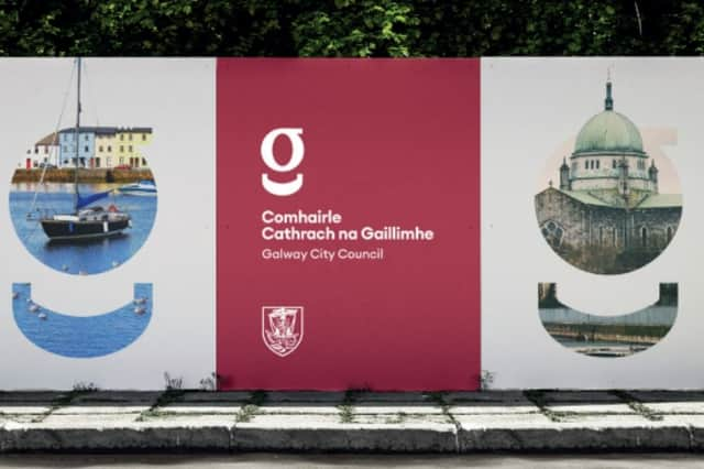
The new identity will be introduced gradually rather than through the wholesale replacement of existing Council materials and assets.
Chief Executive Leonard Cleary said the project was about “more than changing a logo”.
“We need to make it easier for people to recognise the role of the Council and the services we provide,” he said.
“The new identity is one part of that work, while also reflecting Galway's civic heritage and the important place of the Irish language in the city.”
Mr Cleary said staff, elected members and members of the public had brought “a great deal of interest and enthusiasm” to the process and their feedback had helped shape the identity ultimately selected.
Mr McGinn, however, remains firmly of the view that the familiar Galway ‘G’ should have been retained.
Funded by the Local Democracy Reporting Scheme